Design as lifestyle and philosophy. Jonathan Barnbrook and the Design studio Barnbrook
Creators of the new print and electronic design for ART UKRAINE

Isn’t the old English proverb “Life is made up of little things” a great epigraph for an article about design? Once you start thinking about the importance of design in our lives, you immediately understand the level of responsibility of everyone working in this field.
Every time we go outside we deal with numerous objects. Whether we want to or not, these visual images are instantly fixed in our memory. We also come into contact with design, for example, every time we pick up our favorite book or visit a new website.
How do you distinguish good design from bad? The question is ambitious but the answer is very simple, because everyone knows the meaning of “good” and “bad”. It’s another thing not to recognize this ourselves. For some a good design is one that meets all the client’s requirements. For others it’s one that looks complicated, sophisticated and meaningful. A good design is always clear, reasoned, objective, intended for the given space and cultural context, and, most importantly, focused on the recipient. It doesn’t matter whether it’s graphics, landscaping, industrial or web design, the point is the same.
The product, created by the designer based on the client’s idea, enters the real world. Here everything falls into place. Unfortunately, most examples today paint an unflattering picture: clients go after loud advertising aimed at bringing in profits, while designers are passionate about the process – and in this situation few are thinking about the result and consequences.
However, the visual character of our worldview is progressing every day. Less attention is paid to content, text and style, and more to form, image and surface.
Today design has penetrated most aspects of our surrounding reality, and everyone understands its influence on the general visual culture.

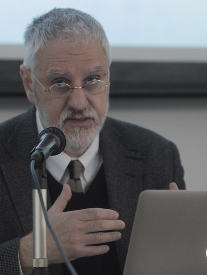
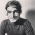
The hero of our article lives in a modest London apartment. He travels to work by metro or bike. He doesn’t own a car because he understands the harm they cause. He also tries to consume responsibly, which can often be a pain for friends and family because he won’t go to Starbucks or drink Coca-Cola. But he thinks it’s worth the effort. Only someone with these convictions can change something for the better in our world. This may be at odds with the stereotypical image we have of the life of one of the most famous designers in the world, but this is the phenomenon of Jonathan Barnbrook.
We want to tell you more about the Brit that wears the title of “one of the most influential designers of our time”. He is one of those people whose profession is their life, for whom disposition is more important than the schools you went to. He doesn’t consider himself an alienated onlooker, but rather an integral part of the world, a creator able to shape it.
“I have said many times that I don’t believe your work is separate from your life, it’s part of it, so I regard what I do in design as an extension of my philosophy.”
Jonathan Barnbrook (b. 1966) lives and works in London. The issue of his education is more a formality - Barnbrook doesn’t care where others went to college. He only pays attention to a person’s work and character – any other approach he considers unfair.
He began studying at 16, spent 8 years in college, obtained a BTEC diploma in graphics from Barnfield College in London (1982-1984); Higher Diploma at Croydon College (1984-85), BA in Graphic Design at Central/St. Martins (1985–88) and finally an MA in graphics at the Royal College of Art (1988–90). He also has an honorary doctorate in typography from Staffordshire University.
Today Jonathan Barnbrook lectures and teaches a lot and still finds time to answer questions from students and anyone interested in design on Twitter and Facebook. Right now he’s working on a research project about Northern Ireland at Middlesex University, and supervising student projects on the same topic.
After graduating, Jonathan Barnbrook began searching for his own way. Back in college in the mid-1980s, teachers suggested following the example of successful designers such as Rodney Fitch and Michael Peters. But even then Jonathan found this utterly boring. Their work had nothing to do with his life experience and was created in the service of marketing - it was a commodity like everything else. At the time there was no talk of cultural values or originality. Today Barnbrook recalls with joy how he decided to find his own way because he can’t imagine working for one of those companies where he didn’t want to end up.
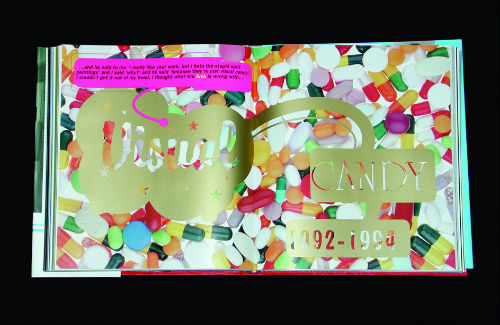
On the international stage, the name Jonathan Barnbrook rang loudly and confidently in 2007 with the opening of his personal exhibition “Friendly Fire” at the Design Museum in London, which included works about the Iraqi war, and the publication of “The Barnbrook Bible”, a collection of his works. He is also known for collaborating with artist Damien Hirst (design of the book “I Want To Spend the Rest of My Life Everywhere, with Everyone, One to One, Always, Forever, Now”, 1997–2003) and musician David Bowie (design of the cover artwork of his 2002 album “Heathen”), and the visual design of several projects at the Saatchi Gallery.

Until recently, he was only known in Ukraine by those who worked in the field. But this summer, everyone that heard about the First Kyiv International Biennale of Contemporary Art ARSENALE 2012 also learned of the person responsible for creating its graphic style. Barnbrook Design studio, headed by Jonathan Barnbrook, began working on the design in November 2011 (the exhibition opened in May 2012).
In preparing for the Kyiv Biennale, Jonathan Barnbrook spent many hours exploring the colors of the natural environment in Kyiv and Mystetskyi Arsenal. The philosophy of Mystetskyi Arsenal and the geography of the building became an integral part of the new logo. Barnbrook Design also designed a font for the complex.
The studio made three completely different designs for ARSENALE 2012 that varied not only in terms of visual accent, but in the understanding of the theme “Best of Times, Worst of Times: Rebirth and Apocalypse in Contemporary Art”. After some changes, one design was selected. The author of the final version was Daniel Streat, a designer at Barnbrook studio.
The visual identity of the biennale was based on four themes: “The Restless Spirit”, “In the Name of Order”, “Flesh” and “The Unquiet Dream”. The lion’s share of the graphic design of the biennale project was based on font.

The Barnbrook Design studio, located in London, was founded in 1990. It specializes in creating corporate identities, innovative books, websites and magazines, and custom fonts. The studio has won many awards in the area of motion graphics working for clients such as the BBC and Grey Advertising alongside producing self-initiated projects.
Unlike the large agency networks, there are only four people working at Barnbrook: Jonathan Barnbrook, designers Daniel Streat and Jonathan Abbot, and an intern. From time to time an accountant visits the studio. The small number of employees doesn’t mean there are few clients. You see Barnbrook values personal contact with the client and is deliberately not building a corporation with hundreds of employees where working conditions differ little from a factory.
Barnbrook focuses special attention on typography. In 1997 he and Marcus Leis Allion started their own font company VirusFonts that has created fonts that are used worldwide: Bastard, Exocet, False Idol, Infidel, Moron, Newspeak, Sarcastic, Shock & Awe, Mason і Virus.
The name comes from the quote "Language is a virus from outer space" attributed to William Burroughs and also Neville Brody's statement that style is a virus and we only really need one typeface.

Jonathan Barnbrook considers typography one of the basic building blocks of design. “You can’t be a good graphic designer without a thorough knowledge of typography,” he says. And good typography is about attention to detail first.
Jonathan Barnbrook puts a lot of emphasis on the names of typefaces. For him it’s like a cross between naming a pop song and a painting. Every day more and more new fonts appear and they require less time to design. In the past a typeface was almost a life’s work, so people would often use their surname. Barnbrook puts a lot of different layers into each name. For example, “Bastard” is a blackletter (or gothic) font and has strong associations with Fascism. Even though blackletter has a large place in the history of typography, most people would associate it with the Nazis, so it was a chance to almost “laugh” at that. But if you bother to look further into the name, you will know that there is a 14–15th Century form of blackletter called “Bastarda” [www.edu.barnbrook.net].
Something else that attracts us to Barnbrook's work is his ability to draw inspiration from his immediate surroundings at a time when most look for ideas on the internet.
That is why everything produced by Jonathan Barnbrook and his studio has its own handwriting; it’s a reflection of personal impressions and views on life. For example, a new font can be inspired by signage and lettering on streets, cathedrals, and public buildings in a London neighborhood with British topography of the early 20th century [Priori. Essay by Rudy VanderLans].
You may be surprised to learn that as a designer Jonathan Barnbrook’s major influences aren’t from design or other designers. His main influence is philosophy and literature. At a time when Ukrainian design studio job vacancies require “knowledge of Tschichold, Raskin, Cooper, Tufte and Altshuller” (which certainly doesn’t hurt) Barnbrook’s top ten book list doesn’t include any on design. Instead you’ll find William Shakespeare, George Orwell, Herman Hesse, Samuel Beckett, Plato, etc. As cliché as it may sound, Barnbrook’s work is more than just graphic design. An eclectic mix of postmodernism, gothic and glitch, it’s not just graphical method - it’s Barnbrook’s worldview.
Contemporary politics and 20th century history are a source of endless inspiration. This is one of the reasons why Jonathan Barnbrook started working on typography. At some point he realized that the history we’re taught in school and hear about from the news is interpretation. This made him skeptical about the idea of the truth. Typography offered him a chance to tell the truth through printed word. “When you are a graphic designer you are at the center of putting out propaganda for somebody and it seems impossible not to question this.”
He now looks at old schoolbooks where he wrote the names of bands on the covers and realizes how important fonts were to him even then. In the time of Punk and New Wave in the late 70s – early 80s the typestyle of each band’s name expressed the ideology and the atmosphere of their music.
Jonathan Barnbrook believes graphic design it is a powerful tool of mass communication that gives you the potential to communicate what you believe to a huge amount of people. It’s not just an industry focused exclusively on marketing. He thinks it’s rubbish when people say that design has to serve the market economy. “This is an imposed political ideal based on an abstract idea called ‘profit’, not human need.”
His political views are leftwing, not communist, of course, but leftwing enough that he remains an opponent of corporate ethics and good old-fashioned commercial design.
His studio has always stood out for its political position and attention to social processes. Barnbrook doesn’t work with big corporations and will turn down jobs from Coca-Cola without hesitation for ethical reasons. He believes design should be socially responsible and says that modern design is too carried away with profits and has become an industry of decoration and sale of unnecessary trinkets.
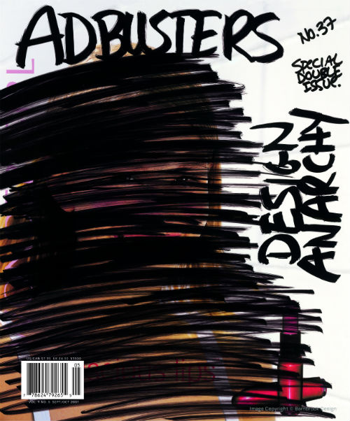
Barnbrook believes design shapes the environment, changing the way we perceive things and informing our choices. In this sense, design is a “culturally valid form of expression”. He believes design can change the world when it works in service of the right people and gets an issue on the mainstream political agenda. In marking this responsibility, Barnbrook has art directed for the anti-corporate collective Adbusters. He participated in the First Things First 2000 Manifesto published in 1999, signed by graphic designers, students and photographers who proposed a reversal of priorities in the way graphic design was used commercially. In 2001 Barnbrook created a billboard entitled “Designers, stay away from corporations that want you to lie for them” – quoting influential American graphic designer Tibor Kalman.

Barnbrook Design does a lot of noncommercial political projects pro bono. For example, Jonathan Barnbrook supports the Occupy London protesters and his studio designed the layout of “The Occupied Times of London” and the movement’s logo. Barnbrook says “an inner anger which is a response to all the unfairness that is in this world’ is a major influence in taking on such projects.

His series of pictograms “Olympukes” (olympics + puke = olympuke) remains significant in this context. He has created a series for every Olympics since 2004 in which sarcasm serves as an antidote to everything going on. The pictograms don’t depict real events, but the hidden state of affairs, all the bribery, political manipulation, drug taking and greed behind the event. “The whole commercial thing makes me uncomfortable,” Jonathan Barnbrook says, as strange as this may sound coming from a graphic designer.

But this is the essence of Jonathan Barnbrook’s personal approach to design – instead of trying to create an image based on the canons of harmony and proper composition, he interprets reality philosophically.

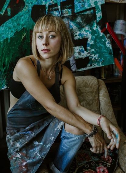
Vera Ganzha
Oleksandr Yudashkin